-
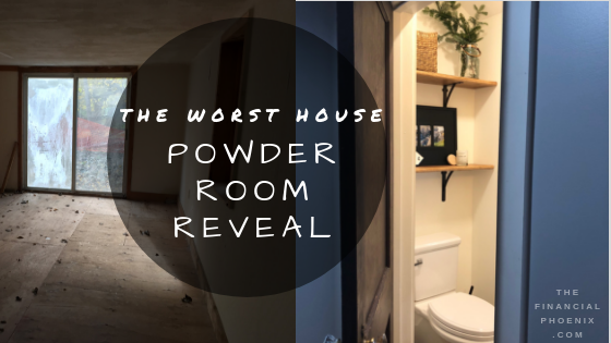
Reveal: Powder Room
It’s rustic, farmhouse, but still sophisticated; check out our finished powder room.
-
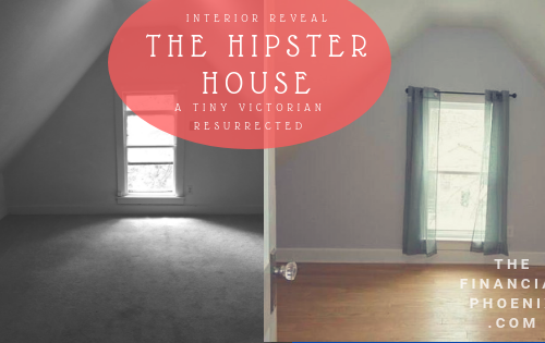
The Hipster House: Tiny Victorian Resurrected (Part 2)
It was an ugly, tiny house. The exterior was all wrong. The hovel was awkward and confined even for 900 sq feet. Everywhere was damp, musty, and dark. The kitchen was located just inside the front door and the bathroom was well, hideous. Unfortunately this tiny house’s issues went beyond the cosmetic. There was no standard stud spacing…or sizes…some of the walls weren’t even made of studs. It was terrible and we made it beautiful.
-
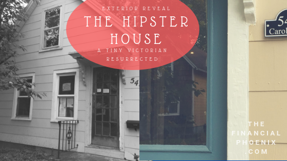
Hipster House Reveal: Tiny Victorian Resurrected (Part 1)
Located in what is considered the “Williamsburg” of our fair city, the neighborhood is full of the young and hip living in old houses. That became the inspiration for the tiny abode; something that paid homage to it’s original life as a modest Victorian cottage but felt updated and hip. Check out the before and after of the exterior.
-
Fresh Start for the Shoddy Cottage: Part 3
The Shoddy Cottage turns fresh and modern! We took on an ambitious 15 day renovation on a DIY disaster and here are the results.
-
Two Week Renovation- The Shoddy Cottage (PART 2)
A number of years ago we bought this great little rental house near a major university. It turns out it wasn't so great and I now refer to it as the Shoddy Cottage. This year we decided to tackle a major upgrade and tackle an ambitious two week renovation- the available time between our old tenants and new tenants. See how this crazy project unfolded. Background This former summer home wasn’t all sunshine. Cosmetically it was looking a little sad, a little outdated, and little disjointed. We also knew there was galvanized plumbing somewhere that was impacting the water pressure and the house was riddled with a maze of pipes…
-
The Shoddy Cottage (Part 1)
A number of years ago we bought this great little rental house near a major university. Well it turns out it wasn’t so great and I now refer to it as the Shoddy Cottage. This year we decided to tackle a major upgrade and renovation in the span 2 weeks- the gap between our old tenants and new tenants. See how this crazy project unfolded. The Scoop Built in the late 1920s as a summer cottage, the house is located on a dead-end street that overlooks the river. Ages ago the wealthy who lived downtown would vacation on the river and this often-forgotten dead-end street contained their summer “homes.” Owners…
-
Demo Day(s): Part One
Demo day. At first, as always, the demo is exciting. You start with the easiest…ugly stuff disappears and light starts to pour in. Then you get the the hard, the really ugly, and the downright disgusting.
-
We Got The WORST House
This house was sad, beyond a fixer upper. The layout was terrible, a colony of squirrels used it as a nut warehouse, and the roof was better for letting in light than keeping out the rain. So naturally I just knew it would be our ideal family home.
-
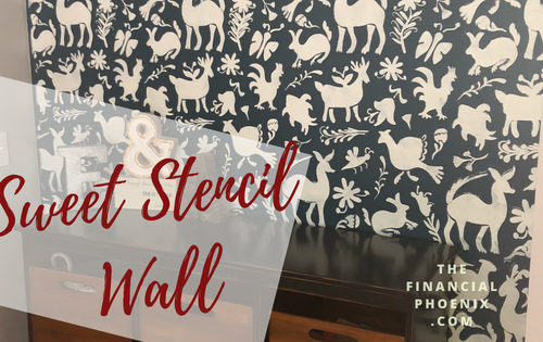
Sweet Stencil Wall
When we redesigned the layout of our new home we really wanted a playroom that could be closed off for noise control but that was visible from our kitchen, living room, and office. We ended up with a playroom that is attached to the living room and office by two sets of doors. The new dilemma: how do you design a fun playroom that won’t cramp your adult style? Well, this adorable stenciled wall was part of our solution.
-
DIY Girls Bathroom Reveal
The girls bathroom reveal you’ve been waiting for! This might be my favorite room in our house although when I walk into the other rooms and realize I really can’t play favorites. The girls’ bathroom does give me the warm and fuzzies. So much love and time went into creating a space that our little princesses could love for years to come. I wanted something sweet, sophisticated, unique, and appropriate for little girls but also something they could grow into over the years. No standard new build bathroom allowed here! It was a tall order and I think we accomplished it. Come on in… First, let’s talk about that door…


